Wisely

Wisely

Wisely

Wisely

This project holds significant personal meaning for me, due to its core mission of promoting sustainability. I took on the role of a product designer within a two-person design team,and this project spanned 16 weeks. This is a reflection of my design thinking and the various visual decisions I made. Starting with a creative brief and user persona, it kickstarts a user-centered design journey. It covers information architecture, interaction design, visual design, design systems, and usability tests.

Challenge

What strategies can we employ to decrease food wastage and embrace a sustainable lifestyle?

Solution

Track: Create lists and track perishable items.

Tips: Access food storage tips and leftover recipes.

Participation: Pledge to reduce food waste and earn badges.

Outcome

Behavioral Shift: Promote sustainable choices

Engagement: Foster community and motivation through participation.

Environmental Impact: Contribute to a greener, sustainable future.

Why Food Wastage?
In New York, we're confronted with sustainability challenges, as research highlights the primary culprits: food waste, energy consumption, water usage, and traffic congestion. Notably, across the USA, a staggering 40% of food ends up discarded annually, with NYC alone contributing 20% to this waste stream.
Food is undeniably central to our daily lives, yet there hasn't been a dedicated solution to tackle the issue of food wastage. The solutions, in fact, seem quite straightforward, revolving around education and promoting responsible consumption. I believe that by bridging the gap and offering consumers both education and tools to monitor their progress and stay motivated, we can make significant strides in reducing food waste.
Research - Target Audience
Food is undeniably central to our daily lives, yet there hasn't been a dedicated solution to tackle the issue of food wastage. The solutions, in fact, seem quite straightforward, revolving around education and promoting responsible consumption. I believe that by bridging the gap and offering consumers both education and tools to monitor their progress and stay motivated, we can make significant strides in reducing food waste.

1st round (did not go as planned!)

New Yorkers aged 24 to 40 who want to live sustainably.

Interview Questions (Unstructured)

“What can you do to avoid food wastage?”

“Do you care about sustainability?”

Insights

  1. Concerned individuals experience disconnection.
  2. Limited awareness of practical measures.

  3. Absence of coordination for larger-scale efforts.

  4. Unclear pathways for effective change.


2nd round (Try! Try!)

Aged 24-40, cooks at home often, eager about sustainability

Interview Questions (Structured)

  • “What's the biggest grocery shopping frustration?”

  • “Know any food preservation tips?”

Insights

  1. Looking for assistance with grocery shopping planning.

  2. Seeking guidance for food storage and waste reduction.

  3. Interested in learning food storage techniques.

  4. Need help with repurposing leftovers.

Why Food Wastage?
In New York, we're confronted with sustainability challenges, as research highlights the primary culprits: food waste, energy consumption, water usage, and traffic congestion. Notably, across the USA, a staggering 40% of food ends up discarded annually, with NYC alone contributing 20% to this waste stream.
Food is undeniably central to our daily lives, yet there hasn't been a dedicated solution to tackle the issue of food wastage. The solutions, in fact, seem quite straightforward, revolving around education and promoting responsible consumption. I believe that by bridging the gap and offering consumers both education and tools to monitor their progress and stay motivated, we can make significant strides in reducing food waste.
Research - Journey Map
I crafted a comprehensive journey map, a visual representation that allowed me to delve deeper into our users' emotional experiences and reactions at different stages.
Research - Journey Map
I crafted a comprehensive journey map, a visual representation that allowed me to delve deeper into our users' emotional experiences and reactions at different stages.

Pain Points

Making and handling lists can be difficult.
Organizing groceries after shopping can be exhausting.
Frequently, fruits and vegetables are left unused in the fridge.
Overcooking and food excess are common problems.
There's limited time to find ways to reduce food waste


Making and handling lists can be difficult.
Organizing groceries after shopping can be exhausting.
Frequently, fruits and vegetables are left unused in the fridge.
Overcooking and food excess are common problems.
There's limited time to find ways to reduce food waste


Making and handling lists can be difficult.
Organizing groceries after shopping can be exhausting.
Frequently, fruits and vegetables are left unused in the fridge.
Overcooking and food excess are common problems.
There's limited time to find ways to reduce food waste


Making and handling lists can be difficult.
Organizing groceries after shopping can be exhausting.
Frequently, fruits and vegetables are left unused in the fridge.
Overcooking and food excess are common problems.
There's limited time to find ways to reduce food waste


Solutions (So Many!)

Facilitate reusable and personalized grocery lists

Offer guidance on proper storage

Provide meal planning and food storage tips.

Propose recipes based on available ingredients or leftovers.

Encourage users to make pledges for food waste reduction motivation.

Foster social cohesion, encouraging food sharing in the community and tips exchange.

Research - Target Audience
Food is undeniably central to our daily lives, yet there hasn't been a dedicated solution to tackle the issue of food wastage. The solutions, in fact, seem quite straightforward, revolving around education and promoting responsible consumption. I believe that by bridging the gap and offering consumers both education and tools to monitor their progress and stay motivated, we can make significant strides in reducing food waste.

1st round (did not go as planned!)

New Yorkers aged 24 to 40 who want to live sustainably.

Interview Questions (Unstructured)

“What can you do to avoid food wastage?”

“Do you care about sustainability?”

Insights

  1. Concerned individuals experience disconnection.
  2. Limited awareness of practical measures.

  3. Absence of coordination for larger-scale efforts.

  4. Unclear pathways for effective change.


2nd round (Try! Try!)

Aged 24-40, cooks at home often, eager about sustainability

Interview Questions (Structured)

  • “What's the biggest grocery shopping frustration?”

  • “Know any food preservation tips?”

Insights

  1. Looking for assistance with grocery shopping planning.

  2. Seeking guidance for food storage and waste reduction.

  3. Interested in learning food storage techniques.

  4. Need help with repurposing leftovers.

Competitive Analysis
During my research, I came across several existing products that caught my attention, such as Olio. These products are remarkable in how they facilitate community sharing of food and various items. While some offerings are more general in their approach, others are tailored specifically to urban residents, especially those living in apartments. One noteworthy example is Copia, which focuses on connecting users with local restaurants. Additionally, I found products like LeftoverSwap, which not only address food waste but also offer creative recipes for making the most of leftovers.
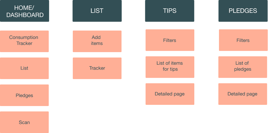
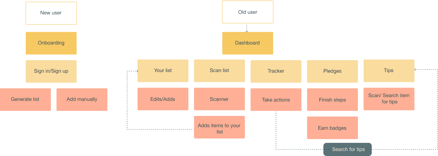
Information Architecture & User Flow
Among the various solutions we looked into, I decided to narrow it down to three that showed the most promise:
An editable list.
A consumption tracker.
A system for providing tips and challenges to encourage user engagement.
Following that decision, I went on to create a sitemap for the application and worked on refining the user workflow.
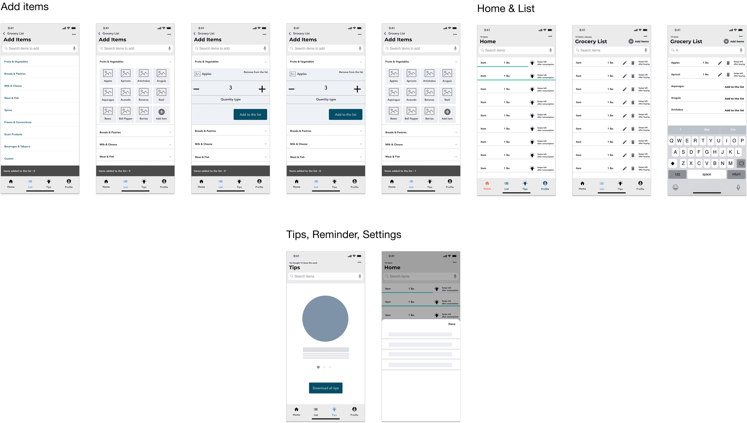
Wireframes
Wireframes
I was eager to understand how these three specific features could be integrated effectively. To achieve this, I decided to construct a wireframe, which is essentially a visual representation of the interface or layout of the application or website. This wireframe would allow me to see how these features could be arranged and interact with each other, helping me evaluate their overall logical flow and user experience.

Pain Points

Making and handling lists can be difficult.
Organizing groceries after shopping can be exhausting.
Frequently, fruits and vegetables are left unused in the fridge.
Overcooking and food excess are common problems.
There's limited time to find ways to reduce food waste


Solutions (So Many!)

Facilitate reusable and personalized grocery lists

Offer guidance on proper storage

Provide meal planning and food storage tips.

Propose recipes based on available ingredients or leftovers.

Encourage users to make pledges for food waste reduction motivation.

Foster social cohesion, encouraging food sharing in the community and tips exchange.
Competitive Analysis
During my research, I came across several existing products that caught my attention, such as Olio. These products are remarkable in how they facilitate community sharing of food and various items. While some offerings are more general in their approach, others are tailored specifically to urban residents, especially those living in apartments. One noteworthy example is Copia, which focuses on connecting users with local restaurants. Additionally, I found products like LeftoverSwap, which not only address food waste but also offer creative recipes for making the most of leftovers.
Logo & Design System
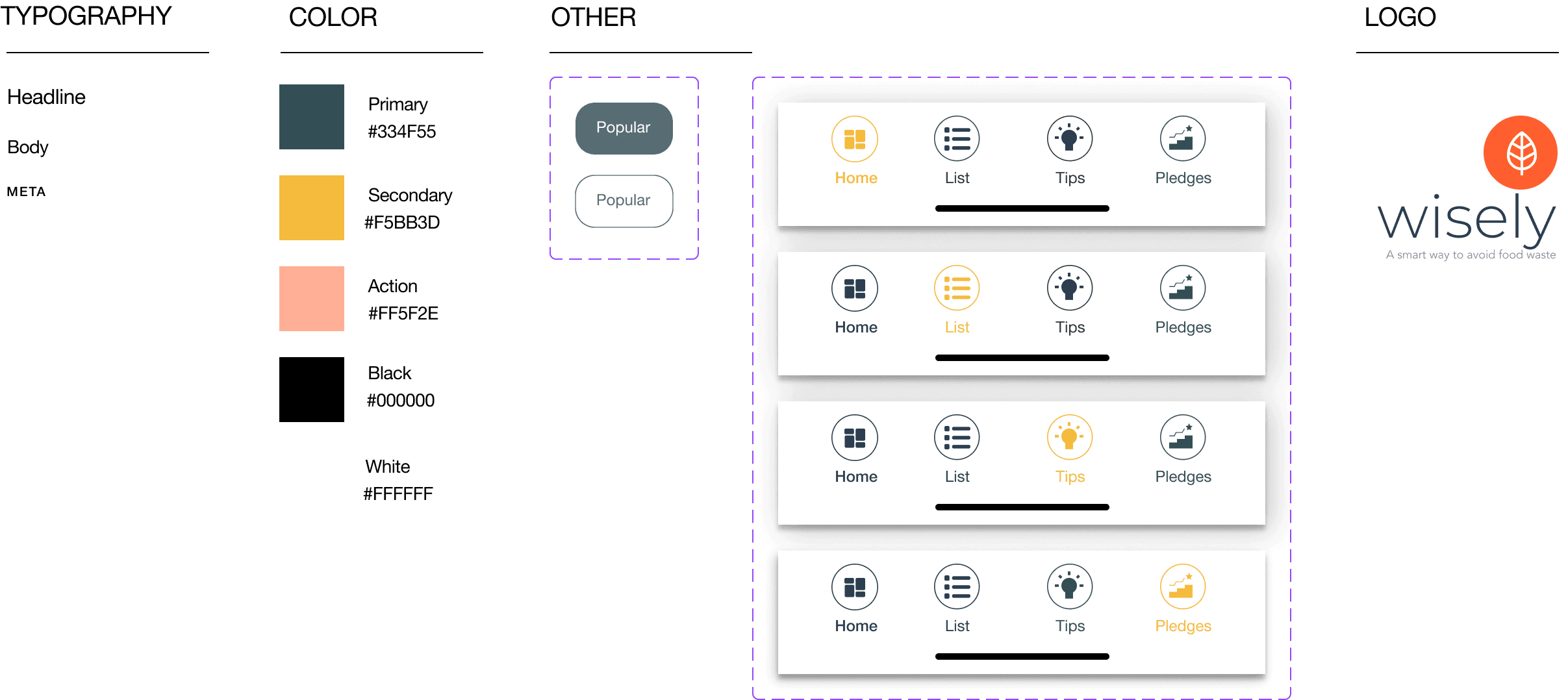
After finalizing the structure, flow, and wireframes of the application using the sitemap and user workflow, I shifted my focus to branding. The next crucial steps involved selecting the right name, choosing app colors, typography, and other design elements, as well as crafting a distinctive logo.

For the app's name, I settled on "Wise," as it conveys intelligence and makes informed decisions, perfectly aligning with the app's mission of reducing food wastage through smart choices.

As for the logo, I envisioned a design featuring a leaf motif and an orange color palette. The leaf symbolizes environmental consciousness and sustainability, while the use of orange evokes positivity and energy, creating an inviting and engaging visual identity for the app.

This branding strategy was devised to connect with users and effectively convey the app's core values.
First Iteration & Pilot Test
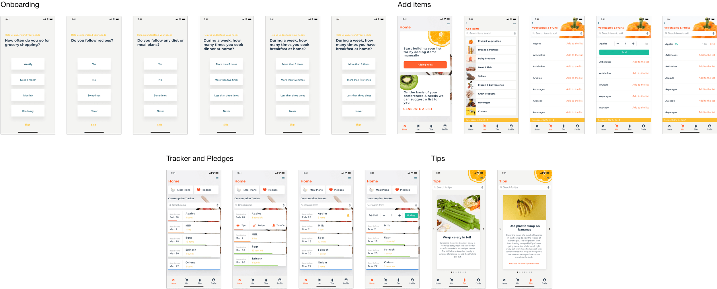
Next, I integrated the design system with the wireframes to visualize the overall look and feel of the application. Following that, I launched a pilot test of the product to gauge user feedback and preferences.

After the initial usability test, I made a few important iterations:
  • Streamlined the onboarding process to emphasize key features and make it more user-friendly.
  • To enhance the overall user experience, we started incorporating images alongside descriptions.
  • Simplified and improved the item editing process to increase user convenience.
  • Introduced user-friendly features like tips, reminders, and recipes for each item, making it easy for users to customize their experience.
Testing & Final Screens
After going through the iteration process, I decided to revisit my designs and conduct additional validation with five more participants. In the previous round, I sensed that something was missing, and people didn't seem entirely satisfied.

My app lacked that crucial sense of motivation and engagement. So, I went back to the drawing board, made some adjustments by introducing pledges, badges, and an impact section, and worked on improving the overall user experience. This time around, when I presented the updated designs, I received notably positive feedback.

Below are the revised design:
After going through the iteration process, I decided to revisit my designs and conduct additional validation with five more participants. In the previous round, I sensed that something was missing, and people didn't seem entirely satisfied.

My app lacked that crucial sense of motivation and engagement. So, I went back to the drawing board, made some adjustments by introducing pledges, badges, and an impact section, and worked on improving the overall user experience. This time around, when I presented the updated designs, I received notably positive feedback.
Below are the revised design:
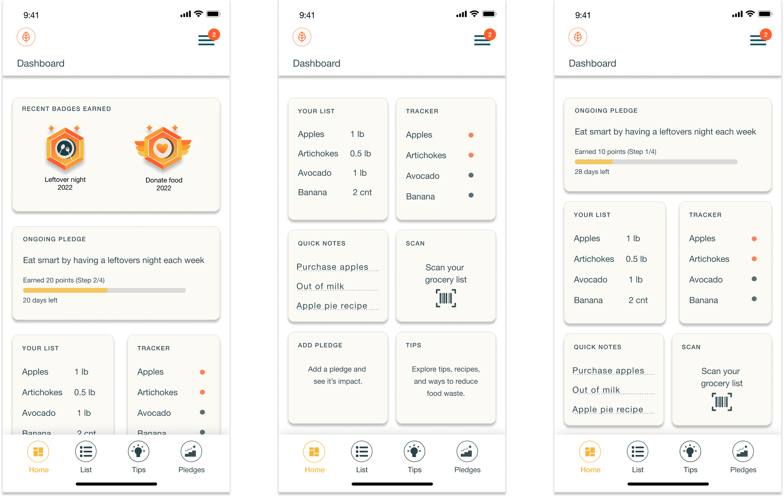
Dashboard
Dashboard
I introduced a dashboard that prominently displays your impact, ongoing pledges, and badges. These boxes are designed in a widget style, providing convenient shortcuts to access your list, tracker, and scanning features. What's even more user-friendly is that I've empowered users to customize their dashboards by allowing them to edit these widgets and choose what they want to see.
List & Tracker
List & Tracker
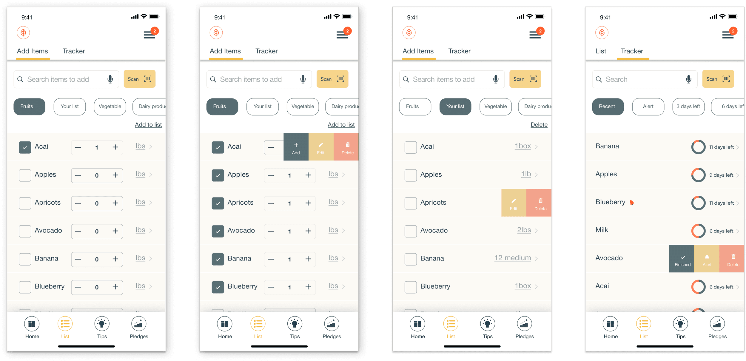
This section focuses on the process of adding items to create a list, editing your previously scanned list, and tracking items. Users can configure alerts for items directly on the tracker page and have the flexibility to edit them as required.
Tips
Tips
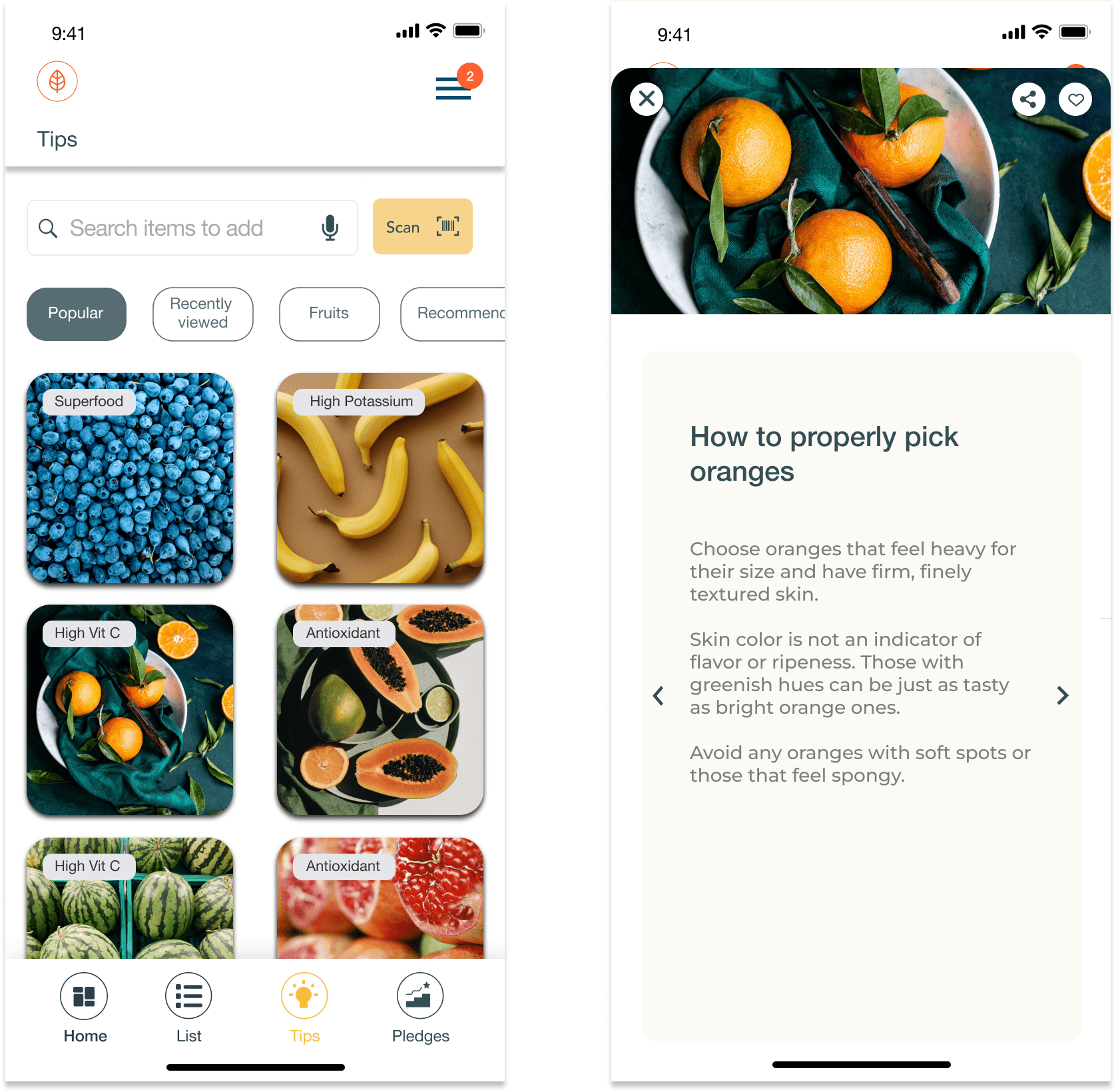
Based on user feedback, we've created a dedicated tips section. Users expressed a strong desire for guidance on reducing food waste. 

As one user aptly put it,

Having tips readily available makes me feel more equipped to reduce food wastage. It's like having a friendly advisor right in the app, and it motivates me to make better choices.
Pledges, Badges & Impact
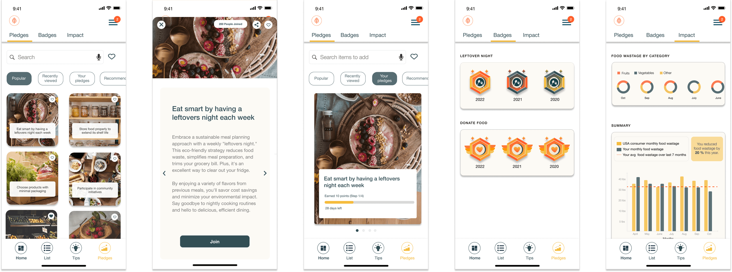
The final and most significant section revolved around motivation and engagement, achieved through pledges, badge rewards, and showcasing impact. Users truly embraced this section.

As one user put it,

The motivation from earning badges and seeing the impact of my actions really keeps me engaged. It's like a positive cycle that encourages me to make even more pledges.
Future Direction
Future Direction
I had a couple of wishes in mind for the next version:
Online Ordering - Integrating with grocery stores like Whole Foods and QFC to enable users to place online orders seamlessly.
Community Engagement - Expanding the range of engagement features, including facilitating connections among users who share common interests and causes in their local communities.
Expansion - Expanding the scope of the app to promote sustainability on multiple fronts like water, energy and other
Sustainability Score - Developing a scoring system that quantifies users' contributions to sustainability in various categories, motivating them to make holistic environmentally conscious choices.
Learnings
Learnings
Building this app has been an incredible experience, and I've gained some valuable insights along the way.
Here are the key lessons I've learned from this project:
  1. Prioritize conducting interviews with the target audience at crucial project stages to gather invaluable insights.
  2. Focus on 2-3 main features, and maintain a simple and efficient design approach to elevate the user experience.
  3. Integrate user testing throughout the development process to ensure a successful project outcome, and be sure to incorporate user feedback iteratively.

© 2024 - Shradha Shree

Designed with love & lots of coffee

© 2024 - Shradha Shree

Designed with love & lots of coffee

© 2024 - Shradha Shree

Designed with love & lots of coffee

© 2024 - Shradha Shree

Designed with love & lots of coffee

© 2024 - Shradha Shree

Designed with love & lots of coffee

© 2024 - Shradha Shree

Designed with love & lots of coffee

© 2024 - Shradha Shree

Designed with love & lots of coffee

© 2024 - Shradha Shree

Designed with love & lots of coffee